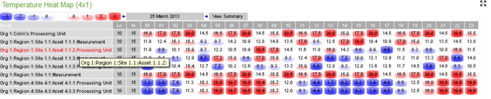
Temperature Heat Map
Widget size: 2 x 1, 4 x 1, Full Page
This widget allows you to look at ranges of temperature data and see where the temperature deviates from within a range.
Whereas the TQI and HACCP widgets are specific to the refrigeration of food items, the Temperature Heat Map widget can be applied to any situation.
The range of temperatures are displayed via icons (or colours) that range in degrees of colour and size. Cells that are white indicate a temperature that is within the correct range.
Configuration requires you to set the following attributes on any point you want to appear in the widget:
- TEMPMAP_SHOW = True.
- TEMPMAP_LOW = enter the value for the low range boundary.
- TEMPMAP_HIGH = enter the value for the high range boundary.
When the widget is opened, you see the current day’s data over a 24hr period and the list of assets that have the correct property values.
Clicking on the View Summary link will display a yearly view (broken down into months), while clicking on a cell will cycle through the monthly, daily and hourly readings.
Clicking on the Asset gives you an Engineering Chart of the data.
Different days can be viewed by clicking the arrows to go back and forth.
Customisation
| Value | Default | Comment |
|---|---|---|
| Widget Heading | Temperature Heat Map | Enter the name of the widget as it is to appear in the heading. |
| DisplayPath | FullPath | Display path for the "Asset" name: - FullPath shows the whole of the hierarchy structure up to and including the point name. - ShortPath shows the parent container name and the point name only. - PointNameOnly shows the point name only. |
| Neg Slot x (x4) | Set the negative threshold values for the respective slots. Each consecutive slot indicates an escalating level of breach. | |
| Pos Slot x (x4) | Set the positive threshold values for the respective slots. Each consecutive slot indicates an escalating level of breach. | |
| Neg Slot x Colour (x4) | Change the colour for the negative temperature bands in the grid. This gives a clear indication of the status of an asset. Only available once colours are selected in the Display Style. | |
| Pos Slot x Colour (x4) | Change the colour for the positive temperature bands in the grid. This gives a clear indication of the status of an asset. Only available once colours are selected in the Display Style. | |
| Display Style | Icon | Display the cells as colours or icons. The coloured icons are the default, but "Colours" allows you to set custom colours in the Pos and Neg Slot colour configuration fields. |
| Aggregate Type | AVG | AVG | MAX | MIN | SUM | COUNT - The formula to be applied for the daily, monthly, yearly aggregated data view |
| Container Ident | 0 | Restrict the widget to points from a particular Container Ident. |
| Refresh Period | No widget refresh | Select a refresh period from the drop down menu from between 15 seconds to 1 hour, or no refresh at all |